clip-pathは要素のどの部分を表示するか(クリッピング領域)を作ります
内側は表示され
外側は非表示です
切り抜き
clip-pathの「basic-shape」
basic-shapeは要素の形状(データ型)です
*「basic-shape」はclip-pathプロパティ以外にもshape-outsideでも使用します
- inset:四角形
- circle:円形
- ellipse:楕円形
- polygon:多角形
- path():SVG のパス
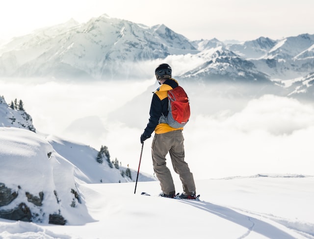
横に並べて比べます(左がクリップ前・右がクリップ後)
inset 四角形inset(上下左右のオフセット round 上下左右の角円の半径)
*上下左右はmarginの一括指定ルールと同じで
基準位置からのオフセット%指定もOK
*roundはオプション(省略可能)border-radiusの一括指定ルールも設定できます
.inset{
 clip-path: inset(20px 30px round 15px);
}
circle 円形circle(円の半径 at 円の中心地点X軸 円の中心地点Y軸)
*atの後に何も指定しない場合はcenterになります
.circle{
  clip-path: circle(30%);
}
ellipse 楕円形ellipse(楕円の半径X軸 楕円の半径Y軸 at 円の中心地点X軸 円の中心地点Y軸)
*atの後に何も指定しない場合はcenterになります
.ellipse{
   clip-path: ellipse(40% 30%);
}
polygon 多角形polygon(頂点のX軸 頂点Y軸 頂点X軸 頂点Y軸 …)
三角形は:polygon(50% 0%, 100% 100%, 0% 100%)
.polygon{
  clip-path: polygon(50% 10%, 90% 90%, 10% 90%)
}
clip-pathのジェネレーターを活用する
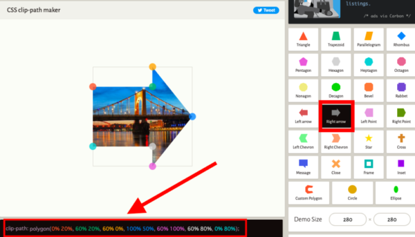
/*枠との間にスペースを入れたかったので0%は10% 100%は90%にしました*/
.clip-path-maker{
 clip-path: polygon(10% 20%, 60% 20%, 60% 10%, 90% 50%, 60% 90%, 60% 80%, 10% 80%);
}備忘録:Safariでの clip-path の挙動に関して
特に、clip-path プロパティの circle() 関数を使用する場合、他のブラウザと異なる挙動を示すことがあります
Safariは -webkit-clip-path というプレフィックス付きのプロパティをサポートしているため、これを使用することで問題が解決する可能性があります
また、CSS変数で管理して、CSS変数の値をアニメーションさせると解決する場合がありました。
:root {
  --clip-size: 0%;
}

.section {
  clip-path: circle(var(--clip-size) at 50% 50%);
  -webkit-clip-path: circle(var(--clip-size) at 50% 50%);
}
//gsapでの例 --clip-sizeの値をアニメーションする
gsap.to(element, {
duration: 1,
ease: "linear",
" --clip-size": "100%", // CSS変数の最終的な値
});画像(SVG)を型にした切り抜き
画像を枠にして切り抜きたい場合
SVGの場合「basic-shape」のpath() はサポートしていないブラウザがあるので
1:「CSSのclip-pathプロパティ」の「clip-source」のurl() でSVGの「clipPath要素」を参照する方がいい
2:SVGの「clipPath要素」を使うなら「CSSのclip-pathプロパティ」ではなくてSVGの画像要素に「clip-path属性」を使ってもいい
*ややこし!!可変にするならもっとややこしそう〜
だからmask-imageプロパティがおすすめだと思います
左側が2・右側が1の方法です
<div class="svg-clip-path">
   <!-- height="0" width="0" が必要 -->
    <svg height="0" width="0" xmlns="http://www.w3.org/2000/svg" viewBox="0px 0px 160 160">
    <!-- SVGのclipPath要素 -->
      <clipPath id="heart">
          <path d="M10,30 A20,20,0,0,1,50,30 A20,20,0,0,1,90,30 Q90,60,50,90 Q10,60,10,30 Z" transform="scale(1.75,1.75)"/>
      </clipPath>
     <!-- SVGの画像要素にclip-path属性 画像の位置調整が簡単 画像の位置も固定される -->
      <image href="..." clip-path="url(#heart)" x="-100" y="0" height="180" width="320"/>
    </svg>
</div>

 <!-- CSS clip-pathで -->
<div class="clip-source">
    <img src="...">
</div>
.svg-clip-path > svg{
width:100%;
height:100%;
}
.clip-source > img{
width:100%;
height:100%;
clip-path: url(#heart);
-webkit-clip-path: url(#heart);
}そもそもSVG以外の画像だったらどうしたらいいの?
CSSのmask-imageプロパティを使います
mask-imageは切り抜き以外にもグラデーションをマスクとして使用できます
mask-image
クリッピングとマスキングについて
「クリッピング」は切り抜きで
「マスキング」は他のオブジェクトの明度でオブジェクトの表示上の透明度を調整する機能です
クリッピングは表示か非表示のどちらかですが
マスキングは透明度を考慮できるので半透明合成もできます
mask-imageで画像を枠にする
「mask-image」の使い方は「background-image」を使う時と同じイメージです
*要ベンダープレフィックス
- mask-image :マスクレイヤー用の画像を指定
- mask-repeat :マスクレイヤー用の画像をリピートするか
- mask-position :マスクレイヤー用の画像の場所指定「x,y」で指定
- mask-size :マスクレイヤー用の画像のサイズ指定「横幅,縦幅」で指定
左の画像を枠に切り抜きます
.mask-test{
  mask-image: url("枠になる画像のパス");
/*マスクレイヤー用の画像の方が大きいのでcontainにしています*/
  mask-size: contain;
  mask-repeat: no-repeat;
  mask-position: 50% 0;
 -webkit-mask-image: url("枠になる画像のパス");
 -webkit-mask-repeat: no-repeat;
 -webkit-mask-size: contain;
 -webkit-mask-position: 50% 0;
}
<div>
<img class="mask-test" src="....">
</div>左のグラデーションを画像に重ねています
img{
  width:100%;
  height:auto;
  mask-image: linear-gradient(black 0%, transparent 100%);
 -webkit-mask-image: linear-gradient(black 0%, transparent 100%);
}background-clip
background-clip(背景の境界を設定します)
テキストで背景を切り抜きます
*要ベンダープレフィックス
.background-clip > .item{
 background-image: url(画像パスやURL);
 background-repeat:no-repeat;
 background-size: cover;
 height: 100px;
 padding:10px;
 border: dashed 3px #fff;
}
.background-clip > .border-box{
 background-clip:border-box; /* 境界の外側 */
}
.background-clip > .padding-box{
 background-clip:padding-box;/* 境界の下に背景はありません */
}
.background-clip > .content-box{
  background-clip:content-box; /* コンテンツボックスの中 */
}
.background-clip > .text{
font-size: clamp(1.5rem, 5vw, 3rem);
line-height:100px;
text-align: center;
font-weight:bold;
color: transparent; /* 色はtransparentにします*/
-webkit-background-clip:text;
background-clip:text;  /*テキストの中に*/
}
<div class="background-clip">
<div class="item border-box"></div>
<div class="item padding-box"></div>
<div class="item content-box"></div>
<div class="item text">BACKGROUND CLIP</div>
</div>clip-pathの便利な実装
斜めの区切りを作る
*ビューポートの幅に対して角度を決める場合「vw」を使います
セクション1
セクション2
セクション3
div{
/*  overflow-y: scroll;
  height:300px; */
  background: #FEFBF3;
}
/* section {height:200px;} */
section:nth-child(1) {
 background: #B1AFFF;
 clip-path: polygon(0 0, 100% 0, 100% calc(100% - 4vw), 0 100%);
}
section::nth-child(3) {
 padding-top: 4vw;
 background: #B1AFFF;
 clip-path: polygon(0 0, 100% 4vw, 100% 100%, 0 100%);
}
<div>
<section class="section-1"></section>
<section class="section-2"></section>
<section class="section-3"></section>
</div>縦に切って遊んでみる
CLIP PATH
CLIP PATH
.section{
 position: relative;
 width:100%;
 height:50vh;
 overflow:hidden;
 background:#ddd;
}
.section > div{
 position: absolute;
 top:0;
 left:0;
 bottom:0;
 width:100%;
 background:#1363DF;
 overflow:hidden;
 clip-path: polygon(0 0, 60% 0, 40% 100%, 0% 100%);
}
.section >p,
.section > div >p {
  margin:0;
  display: grid;
  place-items: center;
  height:50vh;
  font-size:clamp(3.25rem, 8vw, 6.25rem);
  font-weight: bold;
  color:#ddd;
}
.section >p{
 color: #1363DF;
}
<section class="section">
<p>CLIP PATH</p>
<div>
<p>CLIP PATH</p>
</div>
</section>三角のアイコン
.triangle > span{
  background-color: #333;
  height: 24px;
  width: 24px;
}
/* 上 */
.triangle > span:nth-child(1){
 clip-path: polygon(0 100%, 50% 0, 100% 100%);
}
/* 下 */
.triangle > span:nth-child(2){
 clip-path: polygon(0 0, 50% 100%, 100% 0);
}
/* 左 */
.triangle > span:nth-child(3){
 clip-path: polygon(100% 0, 0 50%, 100% 100%);
}
/* 右 */
.triangle > span:nth-child(4){
clip-path: polygon(0 0, 0 100%, 100% 50%);
}
<div class="triangle">
<span></span>
<span></span>
<span></span>
<span></span>
</div>アニメーション
疑似要素「::before(::after)」を使ったエフェクト
*(トリガー)ホバーした時
上から
下から
左から
右から
左上から円形
右下から円形
左上シャッター
右下シャッター
/*上から*/
@keyframes up-down {
  0% { clip-path: inset(0 0 100% 0); }
  50% { clip-path: inset(0); }
  100% { clip-path: inset(100% 0 0 0); }
}
/*下から*/
@keyframes down-up {
  0% { clip-path: inset(100% 0 0 0); }
  50% { clip-path: inset(0); }
  100% { clip-path: inset(0 0 100% 0); }
}
/*左から*/
@keyframes left-right {
  0% { clip-path: inset(0 100% 0 0); }
  50% { clip-path: inset(0); }
  100% { clip-path: inset(0 0 0 100%); }
}
/*右から*/
@keyframes right-left {
  0% { clip-path: inset(0 0 0 100%); }
  50% { clip-path: inset(0); }
  100% { clip-path: inset(0 100% 0 0); }
}
/*左上から円形*/
@keyframes circle-left-top {
   0% {  clip-path: circle(0 at -100% -100%); }
   50% { clip-path: circle(100%); }
   100% { clip-path: circle(0 at 150% 150%); }
}
/*右下から円形*/
@keyframes circle-right-bottom {
   0% {  clip-path: circle(0 at 100% 100%); }
   50% { clip-path: circle(100%); }
   100% { clip-path: circle(0 at -100% -100%); }
}
/*左上からシャッター*/
@keyframes polygon-left-top {
   0% { clip-path: polygon(0 0, 0 0, 0 0); }
   50% {clip-path: polygon(0 0, 300% 0, 0 300%); }
   100% { clip-path: polygon(0 0, 0 0, 0 0); }
}
/*右下からシャッター*/
@keyframes polygon-right-bottom {
   0% { clip-path: polygon(100% 100%, 100% 100%, 100% 100%); }
   50% {clip-path: polygon(100% 100%, -300% 100%, 100% -300%); }
   100% {clip-path: polygon(100% 100%, 100% 100%, 100% 100%); }
}
.clip-path-item > p{
  position: relative;
 }
.clip-path-item > p > span{
 z-index:1;
}
/*疑似要素でカバーを作成*/
.clip-path-item > p::after{
    content: "";
    position: absolute;
    top: 0;
    left: 0;
    width: 100%;
    height: 100%;
    background-color: #ddd;
/*ホバー前は隠す 表示する場合は(0 0 0 0)*/
    clip-path: inset(100% 100% 100% 100%);
}
/*ホバー時にアニメーション*/
.up-down:hover::after{
   animation: 1s up-down;
}
.down-up:hover::after{
   animation: 1s down-up;
}
.left-right:hover::after{
   animation: 1s left-right;
}
.right-left:hover::after{
   animation: 1s right-left;
}
.circle-left-top:hover::after{
   animation: 1s ease-out circle-left-top;
}
.circle-right-bottom:hover::after{
   animation: 1s ease-out circle-right-bottom ;
}
.polygon-left-top:hover::after{
   animation: 1s polygon-left-top;
}
.polygon-right-bottom:hover::after{
   animation: 1s polygon-right-bottom;
}
<!-- 1つのボックス
高さがないのでボックスに高さをつけています
pタグのクラス名をアニメーションの名前にしています -->
<div class="clip-path-item">
<p class="up-down">
<span>上から</span>
</p>
</div>CSS Shapes
テキストの回り込みにshape-outsideを使います
Lorem ipsum dolor sit amet, consectetur adipisci elit, sed eiusmod tempor incidunt ut labore et dolore magna aliqua. Ut enim ad minim veniam, quis nostrum exercitationem ullam corporis suscipit laboriosam, nisi ut aliquid ex ea commodi consequatur. Quis aute iure reprehenderit in voluptate velit esse cillum dolore eu fugiat nulla pariatur.
.shape-outside-test{
  clear:both;
}
.shape-outside-test > .left{
 width: 150px;
 height: 150px;
 background-color: #FFE15D;
 shape-outside: polygon(50% 0%, 61% 35%, 98% 35%, 68% 57%, 79% 91%, 50% 70%, 21% 91%, 32% 57%, 2% 35%, 39% 35%);
 clip-path: polygon(50% 0%, 61% 35%, 98% 35%, 68% 57%, 79% 91%, 50% 70%, 21% 91%, 32% 57%, 2% 35%, 39% 35%);
 float: left;
}
<div class="shape-outside-test">
<div class="left"></div>
<p>
Lorem ipsum dolor sit amet, consectetur adipisci ...
</p>
</div>- shape-outside:float要素に対してシェイプを定義(basic-shapeの形状データが使えます)
- shape-image-threshold:例えばグラデーションの不透過度にあわせてシェイプを定義できます
shape-image-threshold:0.5は不透過度が50%よりも大きい部分 - shape-margin :シェイプに沿った形のマージンを定義します