
Web Animations APIはCSSアニメーションやCSSトランジションをJavaScript から操作するAPIです
*Safari 13.1のリリースからWeb Animations APIはIE以外のブラウザでサポートされています
基本
keyframes :配列(キーフレームオブジェクトの配列)またはオブジェクト(プロパティ名がキー)
options :再生時間を表す整数値(ミリ秒単位)または タイミングプロパティを含むオブジェクト
例:{iterations: Infinity,duration: 3000} 3秒間のアニメーションを無限に
Element.animate(keyframes, options)const box = document.getElementById("box")
box.animate(
[
{ transform: 'rotate(0)', opacity: 1 },// 0%のキーフレーム
{opacity: 0}, // 50%のキーフレーム
{ transform: 'rotate(360deg)', opacity: 1 } // 100%のキーフレーム
]
{
iterations: Infinity,
duration: 5000
}
)keyframes
*アニメーション可能なプロパティと値のセット(KeyframeEffect)
keyframesの2つの設定方法(配列とオブジェクト)があります
//配列(オブジェクトの配列)
[
  { transform: 'rotate(0)', opacity: 1 },// 0%のキーフレーム
  {opacity: 0}, // 50%のキーフレーム
  { transform: 'rotate(360deg)', opacity: 1 } // 100%のキーフレーム
]

//オブジェクト(キーはCSSプロパティ・値は反復する値の配列)
{
  transform: [ 'rotate(0)', 'rotate(360deg)' ], //0%、100% の時の値
  opacity:[1, 0, 1]  // 0%、50%、100% の時の値
}
CSSのプロパティ名はキャメル ケースにします
例:background-color は backgroundColor
offset:0.0から1.0 までの数値またはnull
CSSの@keyframesでパーセンテージで指定するのと同じ
nullまたは指定されていない場合は隣接するキーフレーム間で等間隔になります
/*オブジェクトの配列
カンマで区切ったオフセットを直接指定できる
例では、色は10%で変化する*/
[
  { transform: 'rotate(0)', backgroundColor: '#ccc' },
  { backgroundColor: '#222', offset:0.1},
  { transform: 'rotate(360deg)', backgroundColor: '#ccc' }
]

/*オブジェクト
指定された各オフセットが対応するキーフレームに適用されます
値が不十分な場合、オフセットが指定されていないキーフレームは等間隔になります*/
{
  transform: [ 'rotate(0)', 'rotate(360deg)' ], //0%、100% の時の値
  backgroundColor:['#ccc', '#222', '#ccc'], // 0%、10%、100% の時の値
  offset: [ 0, 0.1, 1]
}
easing
キーフレーム間に適用するイージングを指定できます
指定されたキーフレームから次のキーフレームまでのみ適用されます
*optionsで指定されたイージングは、アニメーションの全体に適用されます
| linear | *初期値 一定の速度 ちなみにCSSではeaseが初期値 |
| ease | 開始と終了はゆっくり |
| ease-in | 最初はゆっくり |
| ease-out | 最初は速く |
| ease-in-out | easeより開始と終了はゆっくり |
| step-start | 開始時点で即変化 |
| step-end | 終了時点で一気に変化する |
| steps(count, start|end) | 段階ごとに変化 |
| cubic-bezier(x1,y1,x2,y2) | ベジエ曲線にそって変化 |
//オブジェクトの配列
[
  { transform: 'rotate(0)', backgroundColor: '#ccc' },
  { backgroundColor: '#222', easing:'step-start'},
  { transform: 'rotate(360deg)', backgroundColor: '#ccc' }
]

//オブジェクト
{
  transform: [ 'rotate(0)', 'rotate(360deg)' ], //0%、100% の時の値
  backgroundColor:['#ccc', '#222', '#ccc'], // 0%、10%、100% の時の値
  easing: ['linear','step-start','linear']
}options
アニメーションの間隔時間のみを指定して1回だけの場合はミリ秒だけを指定できます
document.getElementById("box").animate(
[
  { transform: 'rotate(0)', backgroundColor: '#ccc' },
  { backgroundColor: '#222'},
  { transform: 'rotate(360deg)', backgroundColor: '#ccc' }
],5000)
タイミングプロパティのオブジェクト
ミリ秒単位です
*CSSのように秒指定(3s等)は使えません
| duration | 反復が完了までにかかるミリ秒数 デフォルトは0(0だと実行されません) |
| delay | 開始を遅らせるミリ秒数 デフォルトは0 |
| direction | “normal”:通常 “reverse”:逆方向に実行 “alternate”:反復ごとに方向を切り替える “alternate-reverse”:逆方向に実行し反復ごとに方向を切り替える デフォルトは”normal” |
| easing | 上記参照 |
| endDelay | アニメーションの終了後に遅延するミリ秒数 デフォルトは0 |
| fill | “backwards”:アニメーションの効果を再生前に反映させる “forwards”:アニメーションの効果を再生後も保持する “both”:両方にするかを指定 デフォルトは”none” |
| iterations | アニメーションを繰り返す回数 デフォルトは1 Infinityは無限 |
| iterationStart | 反復のどの時点でアニメーションを開始するか デフォルトは 0.0 *2回反復するアニメーションで0.5にすると1回目の途中から3回目の途中で終了 |
再生の制御
メソッドの抜粋
| pause() | アニメーションの再生を一時停止します |
| play() | アニメーションを開始または再開します |
| reverse() | 逆方向に再生されます 一時停止したアニメーションは逆方向に再開します |
| finish() | アニメーションの最後までスキップ |
| cancel() | 再生を中止します |
| commitStyles() | アニメーションされている要素にスタイルの終了状態を書き込みます *アニメーションが削除された後でも適用される |
<div id="box" style="width:100px; height:100px; background:#ccc; margin: 0 auto"></div>
<button id="play">play</button>
<button id="pause">pause</button>
<script>
const box = document.getElementById("box")
const play = document.getElementById("play")
const pause = document.getElementById("pause")
const animate = box4.animate(
[
  { transform: 'rotate(0)', backgroundColor: '#ccc' },
  { backgroundColor: '#222'},
  { transform: 'rotate(360deg)', backgroundColor: '#ccc' }
],5000)
animate.pause()
play.addEventListener('click',()=>animate1.play())
pause.addEventListener('click',()=>animate1.pause())
</script>イベント
アニメーションの再生が終了したときの登録方法(3パターン)
addEventListener("finish", (event) => {
 //アニメーションが終了した時に実行する処理
 })

onfinish = (event) => {
 //アニメーションが終了した時に実行する処理
}

finished.then(()=> {
  //アニメーションが終了した時に実行する処理
});
// 全てのアニメーションが終わるまで待つ
//getAnimationsの引数に{ subtree: true } を指定するとElementの子孫をターゲットとしたアニメーションも返します
const animations = Element.getAnimations();
const myAnimate = async () => {
await Promise.all(animations.map((animation) => animation.finished));
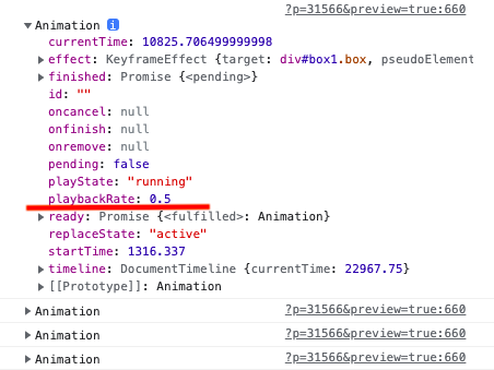
}getAnimations()でアニメーションの情報を取得できます
例:取得した情報からインスタンスのプロパティ(例はplaybackRate再生速度)を変更する
document.getAnimations().forEach(animation=>{
   animation.playbackRate *= .5;
   console.log(animation)
})
使用例
複数の要素に同じ又は一部異なるアニメーションを設定したい時はanimate()の配列を作ると便利です
*delayをズラす例
HELLO WORLD
<style>
.char{
 display: inline-block;
}
</style>
<p class="letters">HELLO WORLD</p>
<button id="start">start</button>
<script>
//JavaScriptで1文字ごとに<span>タグを追加
const el = document.querySelector('.letters');
const start = document.getElementById("start")
 const chars = el.innerHTML.trim().split("");
 el.innerHTML = chars.reduce((acc, char) => {
    char = char.replace(/s+/, ' ');
    return `${acc}<span class="char">${char}</span>`;
  }, "");
//span要素を取得して配列に
const spans = document.querySelectorAll('.char');
const spansArray = Array.from(spans)
//animateの配列
const animations = spansArray.map((char, index) => {
  return char.animate(
    [
      {
        transform: `translateY(50px)`,
        opacity: 0
      },
      {
        transform: `translateY(0px)`,
        opacity: 1
      }
    ],
    {
      duration: 2000,
      easing: 'ease',
      fill: 'backwards',
      delay: 2000/chars.length * index+1
    }
  );
});
animations.forEach(animation=>{
  animation.pause()
})
//クリックした時
start.addEventListener('click', ()=>{
animations.forEach(animation=>{
  animation.finish()
  animation.play()
  })
})
</script>
CSSの@keyframesの値を動的に変更したい時
Web Animations APIを使用することなく
CSS変数を使いsetPropertyでstyle属性に値をセットできますが、Safariではなぜかセットした値がアニメーションに反映されませんでした😂
またrotate3dを使う時にSafariは一気に一回転するコードは動作しません
.box{
 --rotate3d: rotate3d(1,0,0,360deg);
 animation: rotate 10s;
}
@keyframes rotate {
 to{ /*これではSafariでは動作しない、動作するには%で数回に分ける必要が*/
   transform: var(--rotate3d);
  }
}
const box = document.querySelector('.box')
box.style.setProperty('--rotate3d', 'rotate3d(0,1,0,360deg)')そこでSafariにも対応して@keyframes(例ではtransform:rotate3d)を変更をするために
Web Animations APIでアニメーションしてsetKeyframes()でkeyframesの値として変更してみる
*キューブをクリックすると回転軸が変わります
const box = document.querySelector('#box')
const anim = box.animate(
  {
   transform: [ 'rotate3d(0,1,0,0)', 'rotate3d(0,1,0,-120deg)' ,  'rotate3d(0,1,0,-240deg)', 'rotate3d(0,1,0,-360deg)' ],
  },
 {
   iterations: Infinity,
   duration: 10000
 }
)
//要素をクリックしたら,
 let x = true;
  box.addEventListener('click',()=>{
    let val = x ? '0,1,0': '1,0,0'
    x = !x
    anim.effect.setKeyframes( {
     transform: [ `rotate3d(${val},0)`, `rotate3d(${val},-120deg)`, `rotate3d(${val},-240deg)`, `rotate3d(${val},-360deg)` ]
   })
 })