
*デモはiteration-count(繰り返す回数)をinfinite(無限)にしている
SVGをつかう
破線の間隔のパターン(stroke-dasharray)で破線の長さをテキストの枠線の長さ以上にして線の始まりの位置(stroke-dashoffset)をアニメーションする
<style>
.text {
  stroke: black;
  fill:transparent;
  font-size:40px;
  stroke-width: 1px;
  animation: text-move 3s linear infinite;
  stroke-dasharray: 600;
  stroke-dashoffset: 600;
}
@keyframes text-move {
  0% {
    stroke-dashoffset: 600;
  }
  100% {
    stroke-dashoffset: 0;
  }
}
</style>
<div style="border:solid 1px #ccc">
<svg class="text" viewBox="0 0 300 100" xmlns="http://www.w3.org/2000/svg">
   <text x="50%" y="50%" text-anchor="middle" alignment-baseline="middle">Hello</text>
</svg>
</div>symbolをつかってカラフルに
*symbol要素はひな形を定義してuse要素で描画します
<style>
#s-text{font-size:4rem;}
.text-copy {
    fill: none;
    stroke: pink;
    stroke-dasharray: 7% 25%;
    stroke-width: 2px;
    stroke-dashoffset: 0%;
    animation: stroke 4s infinite linear;
}
 .text-copy:nth-child(1) {
    stroke: skyblue;
    animation-delay: -1s;
  }
.text-copy:nth-child(2) {
    stroke: tomato;
    animation-delay: -2s;
 }
.text-copy:nth-child(3){
    stroke: lime;
    animation-delay: -3s;
 }
@keyframes stroke {
  to {
    stroke-dashoffset: -32%;
    }
 }
</style>
<svg viewBox="0 0 300 100">
    <symbol id="s-text">
      <text x="50%" y="50%" text-anchor="middle" alignment-baseline="middle">HELLO</text>
    </symbol>
    <g class = "g-ants">
      <use xlink:href="#s-text" class="text-copy"></use>
      <use xlink:href="#s-text" class="text-copy"></use>
      <use xlink:href="#s-text" class="text-copy"></use>
      <use xlink:href="#s-text" class="text-copy"></use>
      <use xlink:href="#s-text" class="text-copy"></use>
    </g>
</svg>手書き風
テキストの上をアンカーポイントをつないで線を作る(作業が必要💦)
アンカーポイントをつないだ線をマスクにする(stroke-dasharrayで破線にする)
- テキストを書いてアウトライン化
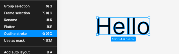
*figmaはオブジェクトを選択して右クリック「outline stroke」 - テキストの上をなぞってアンカーポイントをつなげる(一筆)
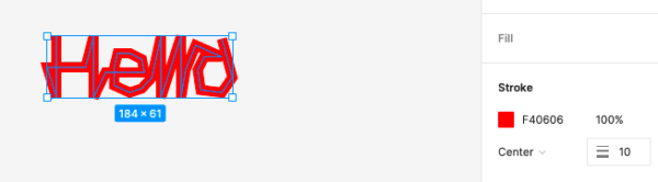
- 線幅を広げてテキストが隠れるようにする
*先に見える線が後で見える線をこえないようにする
書き出したら線で背面のテキスト部分をマスクするために編集します
*線の<path>を<mask>要素で囲みテキストの<path>にmask属性でマスクします
線側(マスク側)のstroke-dasharrayを線の長さ以上にする
stroke-dashoffsetをアニメーションする
ちなみに、赤の線でマスクしているので不透明度が考慮されてテキスト部分の色が薄い
*白の線でマスクするとそのままの色で表示されます
<style>
.mask {
 stroke-dasharray: 850px;
 animation:hello 5s;
}
@keyframes hello{
 0% {
  stroke-dashoffset: 850px;
 }
100% {
  stroke-dashoffset: 0px;
 }
}
</style>
<svg xmlns="http://www.w3.org/2000/svg" width="50%" viewBox="0 0 197 66" fill="none">
 <!--テキストをアウトラインしたパス mask属性を使って線でマスク -->
 <path mask="url(#mask-line)" fill="#000" d="M12.303 ...省略"></path>
 <!--線のパスはmask要素で囲む-->
<mask id="mask-line">
  <path class="mask" stroke="#F40606" stroke-width="10" d="M16 2v61L7 ...省略"></path>
</mask>
</svg>
<script>
//線の長さを確認するとき
const len = document.querySelector(".mask").getTotalLength();
console.log(len) //847.7267456054688
</script>
GSAPのタイムラインを使って2つのテキストを順番に
<style>
svg{
 display:block;
 margin: 0 auto;
}
</style>
<svg xmlns="http://www.w3.org/2000/svg" width="35%" viewBox="0 0 199 58" fill="none">
   <path mask="url(#mask1)" fill="#222" d="M8.688 ...省略/>
    <mask id="mask1">
      <path class="mask1" stroke="#fff" stroke-width="8" d="M5.5 4v44.5l3-22h15l7-25V29L32 46.5 38.5 24 67 15l-11.5 9-9.5 5-5 10.5 5 7 9.5-3L62 35l2.5-13.5L67 35v13.5L72 35l1.5-13.5 14.5 27 14-29 3 4.5 2.5 5 16 2.5L133 29l-6-7.5-9-2-6.5 4.5-4 14 4 8.5h9l9.5-3 6-4L158 24l34.5-9-16.5 9-7 7.5-3 12 7.5 3 9.5-3 6-10.5V20.5l3.5 14.5 2.5 13.5"/>
    </mask>
   </svg>
 <svg xmlns="http://www.w3.org/2000/svg" width="50%" viewBox="0 0 292 90" fill="none">
   <path mask="url(#mask2)" fill="#222" d="m22.75 ...省略 />
    <mask id="mask2">
      <path class="mask2" stroke="#fff" stroke-width="8" d="M32.5 30.5h-12L13 34l-5 7.5-3 8L8 54l12.5-4.5 5-5.5 7-10v30.5l-2.5 11-9.5 4H8L36 85l5-15.5L38.5 24 46 54V30.5L58.5 27H70l8.5 10h13l11-3-4-7-7-3-8 3-5 3.5-4 11 2.5 6 9.5 6.5 10-2.5 6-4L112 27l16.5-6L118 34l-8.5 10 2.5 7.5 12-2 4-11 2.5-12.5 4 28 6.5-23.5h24l-13-18V54l35.5-23.5 27-3.5-14.5 7-8 10 3.5 7.5H207l7.5-7.5 2.5-10 3-30.5-4.5 54.5 5-21 7-16 28.5-6-19.5 15.5-7.5 10-2 10 17.5-3L248 37V26l4.5 28 6.5-23.5L271 49l9-25h9.5L274 64.5l-6.5 18"/>
    </mask>
 </svg>
<script src="https://cdnjs.cloudflare.com/ajax/libs/gsap/3.10.4/gsap.min.js"></script>
<script>
const textTl = gsap.timeline({
  repeat: -1,
});
textTl.set([".mask1", ".mask2"], {
   strokeDasharray:"1300px"  //strokeDasharrayのセットが必要
 })
.from(".mask1", 3, {
  strokeDashoffset: "1300px"
 })
.from(".mask2", 3,{
  strokeDashoffset: "1300px"
 })
</script>clip-pathをつかう
テキストは同じサイズの擬似要素で隠しておく
擬似要素のクリッピング領域を移動させる
*2行になると崩壊する
<style>
.text-wrap{
  height:150px;
  display: flex;
  justify-content: center;
  align-items: center;
  background-color:#ccc;
}
.text-wrap > p{
  position: relative;
  font-size: 3em;
 }
.text-wrap > p::before{
  content: "";
  position: absolute;
  top: 0;
  left: 0;
  right:0;
  bottom:0;
  background-color: #ccc;
  clip-path: inset(0 0 0 0);
  animation: animate 3s linear;
}
@keyframes animate{
  0% { clip-path: inset(0); }
 100% { clip-path: inset(0 0 0 130%); }
}
</style>
<div class="text-wrap"><p>HELLO</p></div>
HELLO
/* 上から */
@keyframes animate {
  0% { clip-path: inset(0); }
 100% { clip-path: inset(130% 0 0 0); }
}
HELLO
タイプライター風
timing-functionにsteps(文字数)を使う
*今回はclip-pathではなくleftを移動する
<style>
p{
 font-feature-settings: normal; /*文字間隔を均等に*/
 width:max-content; /*文字分の幅に*/
 position:relative;
 line-height: 1.1;
}
p::before,
p::after{
 position:absolute;
 content:'';
 top:0;
 left:0;
 right:0;
 bottom:0;
}
p::before{
 background: white;
 animation: typing 7s steps(11) forwards;
}
p::after{
 width:2px;
 background:black;
 animation: typing 7s steps(11) forwards,
            blink 0.7s steps(11) infinite;
}
@keyframes typing{
 to{left:100%;}
}
@keyframes blink{
 to{background:transparent;}
}
</style>
 <p class="text3" style="font-size:1.5rem;">あいうえお、かきくけこ</p>
あいうえお、かきくけこ
JavaScriptをつかう
1文字づつにアニメーションを適応するときはJavaScriptで<span>タグを追加すると便利です
<style>
.letters{
 font-size:2rem;
}
/*inline-block:transformはインラインには適用されないので必要*/
.char{
 display: inline-block;
 animation: animate-chars 2.2s;
}
@keyframes animate-chars {
  0% {
    opacity: 0;
    transform: translateY(50px)
  }
  100% {
    opacity: 1;
    transform: translateY(0px)
  }
}
.char:nth-child(2){animation-delay: 0.2s;}
.char:nth-child(3){animation-delay: 0.4s;}
.char:nth-child(4){animation-delay: 0.6s;}
.char:nth-child(5){animation-delay: 0.8s;}
.char:nth-child(6){animation-delay: 1s;}
.char:nth-child(7){animation-delay: 1.2s;}
.char:nth-child(8){animation-delay: 1.4s;}
.char:nth-child(9){animation-delay: 1.6s;}
.char:nth-child(10){animation-delay: 1.8s;}
.char:nth-child(11){animation-delay: 2s;}
</style>
</style>
<p class="letters">HELLO WORLD</p>
<script>
 const el = document.querySelector('.letters');
 const chars = el.innerHTML.trim().split(""); //文字を配列に
 el.innerHTML = chars.reduce((acc, char) => {
    char = char.replace(/s+/, ' '); //スペースを特殊文字に変換
    return `${acc}<span class="char">${char}</span>`; //1文字づつspanタグで囲む
  }, "");
</script>
HELLO WORLD
1文字ごとに遅延時間を設定する別の方法
GSAPの「stagger」で1文字ごとのアニメーションのタイミングをずらす
<style>
.char{
 display: inline-block;
}
</style>
 <p class="letters" style="font-size:2rem;">HELLO WORLD</p>
<script>
//<span>タグを追加するためのJSは省略
gsap.from(".char", 2.2,{
 y: 50,
 autoAlpha:0,
 stagger:0.2,
 repeat:-1,
})
</script>
HELLO WORLD
setIntervalで数ミリ秒ごとにクラスをつける
*transitionで実装できる
<style>
.char{
  display: inline-block;
  transition: all 0.5s ease;
  opacity: 0;
  transform: translateY(50px);
}
.char.fade{
 opacity: 1;
 transform: translateY(0px)
}
</style>
 <p class="letters" style="font-size:2rem;">HELLO WORLD</p>
 <button class="btn">スタート</button>
<script>
 const btn = document.querySelector('.btn');
 const el = document.querySelector('.letters');
 const chars = el.innerHTML.trim().split("");
 el.innerHTML = chars.reduce((acc, char) => {
    char = char.replace(/s+/, ' ');
    return `${acc}<span class="char">${char}</span>`;
  }, "");
function toggleClass(){
 let i = 0
 let timer = setInterval(()=>{
  const span = el.querySelectorAll('.char')[i]
  span.classList.toggle('fade')
  i++
  if(i === chars.length){
    clearInterval(timer)
    timer = null
    i = 0
   }
  },50) //50ミリ秒ごと
 }
btn.addEventListener('click', toggleClass)
</script>
HELLO WORLD
Web Animations APIを使う
エフェクト
「text-shadow」でテキストに影をつけますtext-shadow:左右の位置 上下の位置 ぼかし 色;
複数の影はカンマで区切って設定できる
背景は#ece5da
.text{
  font-weight:bold;
  color: #f1ebe5;
  text-shadow:
    0 13.36px 8.896px #c4b59d,
    0 -2px 1px #fff;
}
ABC
ネオン風にする
text-shadowをアニメーションする
.text{
 color: black;
 animation: animation1 2s linear infinite;
}
@keyframes animation1{
0%,100%{
  color: white;
  filter:blur(1px);
  text-shadow: 0 0 10px red, 0 0 20px red, 0 0 40px red, 0 0 80px red, 0 0 120px red, 0 0 200px red, 0 0 300px red;
}
50%{
  color: black;
  filter:blur(1px);
  text-shadow: none;
}
}
ABC
擬似要素で影を追加
.text::before{
  position:absolute;
  content:'';
  top:35%;
  left:0;
  width:100%;
  height:100%;
  background:red;
  transform:perspective(1em) rotateX(45deg) scale(1, 0.1);
  filter:blur(0.5em);
}
ABC
「background-clip」は背景の境界を設定するプロパティでbackground-clip:textはテキストで背景を切り抜くことができます
<style>
.text{
 background-image: url(https://koro-koro.com/wp-content/uploads/2022/11/background-clip-test.jpg);
 background-repeat:no-repeat;
 background-size: cover;
 height: 100px;
 font-size: 6rem;
 font-weight:bold;
 line-height:100px;
 text-align: center;
 color: transparent;
 background-clip:text;
  -webkit-background-clip:text;
}
</style>
<div style="background:#333;">
 <div class="text">ABCD</div>
</div>background-sizeは背景画像の寸法を設定
- キーワード値:coverまたはcontain
- 値が1つ:画像の幅を指定 (高さは auto)
- 値が 2つ: 1つ目は画像の幅、2つ目は高さ
- 複数背景の場合はカンマで区切る
background-positionは背景画像の初期位置を設定
- キーワード値 :top・bottom・left・right・center
- 値:X Y
- 辺からのオフセット値:(例)bottom 10px right 20px
- 複数背景の場合はカンマで区切る
background-clip:textをつかいテキストで画像(グラデーション)を切り抜く
background-position(位置)をX軸(横)にアニメーションする
<style>
.text{
/*グラデーション部分をなくしたしましま模様*/
  background-image: linear-gradient(-90deg, #4158D0 0% 30%, #C850C0 30% 70%, #FFCC70 70% 100%);
/*文字でグラデーションを切り抜く*/
  background-clip: text;
   -webkit-background-clip: text;
  color: transparent;
  background-size: 200%;
  animation: textclip 4s linear infinite;
}
@keyframes textclip {
  to {
    background-position: -200% 0;
  }
}
</style>
<div class="text-box">
 <p class="text">ABC</p>
</div>
ABC
斜めのグラデーションをY軸(縦)にアニメーション
.text{
   font-weight:bold;
   background-image: linear-gradient(43deg, #4158D0 0%, #C850C0 46%, #FFCC70 100%);
   background-clip: text;
    -webkit-background-clip: text;
   color: transparent;
   background-size: 100% 20px;
   animation: stripes 4s linear infinite;
  }
@keyframes stripes {
  to {
     background-position: 0 50%;
     }
  }
ABC